As we track activity using Task, the data is getting used across lots of different systems – its one way Task makes you more efficient! Here are a few pointers on creating good Tasks, and why.
Labels, short – Instructions, long!
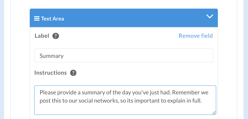
When you are getting information back from Taskers – requesting data in the form of text fields, images, dropdowns etc – always aim to keep the label short and use the “instructions” box to instruct what you want your Tasker to do, for example:
Why do this?
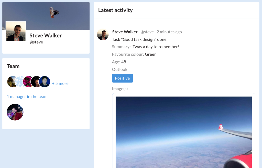
Let’s say your Tasker writes “‘Twas a day to remember”, you will have an entry in the timeline that says something like:
Summary: ‘Twas a day to remember
Think summary and image sandwich
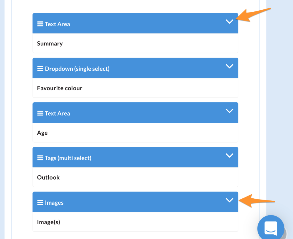
A good rule of thumb is to start with a text summary and end with images – put your structured data in the middle, for example:
Why do this?
- Timelines look good. You start with a summary or some descriptive text that is engaging – you end the timeline with imagery
- It works on social networks – if you share out to Facebook or Twitter etc – the summary is the first item seen – typically this will be more interesting than structured data
Seeing it in action
With my simple task created above, the mobile interface is really clear and easy to understand for my Taskers, with clear instructions:
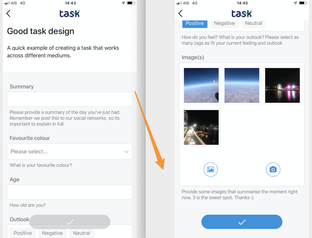
… and it looks good when displayed on the timeline:
By designing Tasks well you get the most out of them. They work well for marketing purposes, informing Funders, giving critical structured reporting data – and they are easy for your team to understand.
